Elastic Path Changelog

Keep up with changes to Elastic Path services by subscribing to our RSS Feed, Atom Feed, or JSON Feed

Overview

This release is a massive one for us, but the notes on what is included are very, very short. This release was all about getting something that we've been wanting to release for quite some time - Media Micro Service (MMS).

MMS will allow us to improve the ways that Unstack handles images and unlocks a couple paths for us to do some cool stuff with media going forward. We don't have anything to share on this at the moment, but promise that we will have more to come on this at a later date.

Complete List of Resolved Items

  • Other than MMS, no other fixes or adjustments went out with this release.

Major You can now sort your hierarchies so that they are displayed in the order that you want in your catalogs. For more information, see Update a catalog.

Major Price book stacking allows you to create multiple price books. When creating a catalog you can assign a priority to your price books so that product prices are displayed according to the priority of the price books. See Create a catlog.

Major You can now manage Personal Data within Elastic Path. Log entries are now being captured for any personal data as well as related personal data. For more information, see:

Major Commerce Manager: You can use price modifiers to change the prices of your child products. See Creating price modifiers.

Minor Commerce Manager: When viewing an order, you can now click a product name to view the product details. See Orders.

Minor Commerce Manager: New Total Orders and Total Value of All Orders fields and improved layout available in Analytics. See Analytics.

Minor Commerce Manager: The Rename store field is now moved to Settings > Store Settings page. For more information, see Renaming a Store.

Overview

With this release we shipped Smartlinks for products and a number of improvements to our Klaviyo integration.

Smartlinks for Products

With this feature release it's now possible to turn any link or button into an "Add to Cart" button.

Simply enter the name of the product and select it in the auto-complete menu for the link. Then choose “Add to cart” from the action dropdown.

Identifying Klaviyo Users

With this release we rolled out a series of changes that unify Klaviyo's user IDs with CX-Studio's user IDs. This makes it possible to build conditional content based on Klaviyo data which drastically expands our personalization capabilities.

Complete List of Resolved Items

  • Updated the intro video used in the page editor.
  • Resolved an issue where template options weren't sorting properly.
  • Resolved an issue where non-ecommerce prebuilt sections were showing in ecommerce accounts.
  • Fixed an issue where the images in "Logos" components were broken when using liquid header/footer
  • Added NoML support for defaultBorderWidth, defaultBorderColor, defaultBorderRadius, and default BorderStyle.
  • Fixed an issue where the editor would sometimes crash on older Shopify accounts.
  • Improved the way that Studio handles product deletion. Now if a product is deleted from Shopify, all CX-Studio pages with references to that product will be unpublished.
  • Fixed an issue where the price shown in the product component wouldn't appear properly on both light and dark backgrounds.
  • Implemented a way for Studio to make a distinction on whether a variant is a specific color option.
  • Added support for arrow functions (ex: =>) in the section editor.
  • Added support for linking directly to products via smart links.
  • Fixed an issue where text added to the "Box Callout (Split)" component would display outside of the box when rendered.
  • Fixed two bugs with "Gallery" component; one where there was extra space on top of the first row of images, and the second where text underneath the gallery images would align centered in the editor but would align left in the rendered version.
  • Fixed several issues with the "Side by Side Media" component. One where alignment wasn't working properly, another where text and the (+) icon would overlap, and finally one where we changed the terminology used with alignment on the component; instead of "Left/Right" it now says "Default/Reversed".
  • Changed the order of alignment properties on all components; instead of "Center, Left, Right" they know show as "Left, Center, Right".
  • Added support for matching Studio users to a Klaviyo Exchange ID - if applicable.
  • Updated developer documentation with new screenshots, and added notes for using <Generator>, using <Product> generator, and for working with layouts, component properties, and plugins.
  • Updated contact sync process so that accounts with a large numbers of contacts are processed in a more efficient manner

Overview

Release 140 had a little bit of everything with improvements to our Klaviyo integration, margin controls, better CSS targeting, and app performance topping the list. We also managed to squash a bug where some users were getting multiple new lead email notifications.

Margin Controls

We rolled out some changes to the style guide that allow you to adjust margins on headings and text. This should give users greater control over how their site looks.

Targeting Sections and Boxes with Custom Code

We rolled out a number of changes to enable targeting of specific boxes or section with custom code. This will be particularly helpful for any of our users who want to use custom CSS or custom JavaScript.

App Performance

We also rolled out a change in the way that the Unstack app loads our JavaScript packages. This should make it much snappier when loading in the browser

Fixed issue with multiple lead notification emails!

A number of customers were reporting multiple notifications were being sent when forms were filled out. This was a persistent issue over a couple of weeks so if you're reading this and you see the issue again please let us know!

Media Upload Limit Changed to 50mb

A welcome change for video and large images, we’ve changed the upload limits to 50MB from 10MB.

Klaviyo Integration Improvements

We've added support for pushing events to Klaviyo for Viewed Page, Viewed Product and Added Product to Cart.

Complete List of Resolved Items

  • Removed the hover effects on product component media when hovering in the editor.
  • Updated the add to cart button on live pages to appear as "disabled" until a variant has been selected.
  • Fixed an issue with the collection component that would prevent the toggled header from being edited.
  • Fixed an issue where collection components were using a products last image rather than the first image.
  • Fixed an issue with the alignment of items in the "Media with Stacked Callout" component.
  • Fixed an issue where the standard Media/Text component was missing on some accounts.
  • Added support for adding CSS classes to sections and boxes within the editor.
  • Added full margin controls for headers to the Style Guide.
  • Fixed an issue where header spacing for H6 wasn't able to be defined.
  • Added support for Klaviyo events; Viewed Page, Viewed Product, and Added Product to Cart.
  • Added support for boolean component properties (more on this soon!)
  • Fixed an issue where official template pages sometimes had their links persist in the new account.
  • Fixed an issue where our support chat would prefill information about the user, but this information was unchangeable. Now this information is fully editable.
  • Improved app responsiveness by changing the way that several third party modules load.
  • Fixed an issue where liquid footers had a form present that shouldn't have been present.
  • Fixed an issue where multiple email notifications were being sent out for the same lead.
  • Updated language for "Quotes" in the Style Guide, to "Large Quotes"
  • Increased the maximum file upload size from 10mb to 50mb.
  • Fixed an issue where some users were getting an error that read "a page with that URL exists" despite no page with that URL existing.
  • Fixed an issue where article previews were rendering hyperlinked text with an extra space.
  • Fixed an issue where smart links on images in the article body weren't working properly.
  • Fixed an issue where custom pre-built sections were being shown before the standard components in the component selector.

Major Added PayPal Express Checkout payment method. For more information, see PayPal Express Checkout and PayPal Express Checkout Payments. You can also use PayPal Express Checkout in Commerce Manager.

Major Commerce Manager: You can now localize your product names and descriptions. See Configuring Locales.

Major Commerce Manager: WYSIWYG visual editor added to the description field for products. See Adding Product Details.

Major Commerce Manager: Locale settings added to Settings -> Locales. See Locales.

Minor Commerce Manager: Variation selection improvement when adding variations to a product. We now have paginated results on variation listing in the product association screen.

Minor Commerce Manager: UI Improvement. Sale Price Start and End date no longer autofills when adding a new sale price to a product.

Major Commerce Manager: You can use store analytics, including total orders made and total value of orders, over a period of time that you select.

Major Commerce Manager: You can search on partial SKU in Products, see Searching Products by SKU.

Major Commerce Manager: You can create product descriptions with rich text formatting.

Minor Commerce Manager: You can sort nodes by dragging and dropping them.

Overview

In release 139 we've added a number of new style guide settings and editor improvements!

Box Border Styles

We've made it easy to build round boxes and even add dotted or dashed borders to simulate coupons.

Also, check out that new fancy color picker!

Additional Headings

We're added support for additional header styles. H1, H2, H3 are configured by default, but you are now able to add H4, H5, and H6.

Toggles for product collections

We added toggles for Title & Price to the product collection component. We also made it possible to adjust the gap between products.

Complete List of Resolved Items

  • Added support for border width, color, dash, and radius on box toolbars.
  • Added a tooltip under the page path field so that entering text into that field will now show what the final URL will look like.
  • Added support for H4, H5, H6.
  • Fixed an issue where the color option for Blog H2 wasn't lined up properly in the Style Guide.
  • Fixed an issue where some product sizes wouldn't show up as "in stock".
  • Fixed an issue where the previous image/next image arrows in the product component would be misaligned vertically on first load.
  • Fixed an issue where the second image in a product component would sometimes be pushed to the following row if there was a long product description or many thumbnails.
  • Fixed an error that would appear if were multiple product components were added to the same page.
  • Added support for a "Gap" between items in a product collection component.
  • Added support for price and title toggles for the product collection component.
  • Fixed an issue where products in a collection component would show the prices multiple times.
  • Fixed an issue where the number of columns in a collection component couldn't be changed if a product wasn't already added to the component.
  • Fixed an issue where some 301 redirects weren't properly including the proxy path in the redirect URL.
  • Fixed an issue where entering an operator for the first time when defining a condition would take two clicks to respond, rather than one.
  • Updated the images used in the quickstart section of the Unstack Admin.
  • Adjusted the quickstart integration list to no longer include HubSpot or Salesforce if the user is an eCommerce merchant.
  • Fixed an issue where the bubble behind the number of items in the a users "bag" was showing up as transparent.
  • Fixed an issue where primary button would disappear on hover.
  • Fixed an issue where solo buttons were sometimes misaligned.
  • Fixed an issue where "&" was not rendering properly in the article preview.
  • Fixed an issue where sections with long names forced other sections to wrap to the next line in the section editor list.
  • Fixed an editor-specific form alignment issue.
  • Fixed an issue where the footer logo placeholder text would show properly in the editor, but the placeholder image would appear in the rendered page.

Overview

An exciting release! For our Shopify users we have added support for using Shopify's "liquid" header and footer with the pages you create in Unstack. At the moment this isn't yet enabled for all stores, but will be in the coming weeks once we're able to test it with some of our partners.

Shopify header, footer, and cart

As mentioned above, this feature isn't yet enabled for all stores as it's in need of some additional testing with our partners before we push it live for everyone.

That said, once it's live you'll be able to use your existing header, footer, and your cart (including upsell options!) with the pages you create with Unstack.

Complete List of Resolved Items

  • Added support for liquid header.
  • Added support for liquid footer.
  • Improved toolbar handling when top padding of section is set to "0".
  • Pushed changes to the way that the in-app chat widget appears and behaves.
  • Pushed a change to the way user data is handled when removing the Unstack app from Shopify.
  • Fixed an issue with template visibility.
  • Fixed an issue where carousels were not working properly.
  • Fixed an issue where a page's URL could be the same as the URL used for the blog.
  • Fixed an issue where the editor would break after navigating to "Header & Footer" from the editor.
  • Adjust the placeholder text in the in-app search bar so it is no longer cut off.
  • Fixed a behavior issue with toolbars in the article editor after activating the table of contents.
  • Fixed the non-functional rich text field in the Split Textcomponent.
  • Fixed an issue with the templates block in the embedded app where the scroll-arrows were missing.

Overview

This was our biggest release in several weeks with many things being shipped for the start of Q2!

Improved Embedded app Start Screen

Previously, when a user first adds the Unstack App to their Shopify account they were taken a very minimalistic channel settings page that, at it's core, served as a way for users to open Unstack.

That said, we realized this page could be much more which led to the below changes; specifically the ability to access both your page templates and branding options from this page.

Our hope is here that these changes should help our users make more progress on their goals, with fewer clicks.

Product research pop up

As part of our ongoing efforts to understand the reasons our users sign up for Unstack in the first place, we have added a popup question that appears when you first install the Shopify app
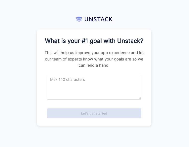
Pop-up Question

Capitalization and letter-spacing

If you're a user who likes the text of their headers or buttons to always be capitalized, lowercase, or mixed case you are in luck! With this release we shipped changes to the Style Guide which allows you to make those changes at the account level.

Product Collection Component Changes

Using component properties, we added several layout options to the "Product Collection" component. Specifically the ability

DDC Import & Export

Data Driven Content, or DDC is a beta feature that we're very proud of. However, as a beta feature there is a lot of work that still needs to get done. The release of the import & export feature is one of those things that has been in the works for some time and is a huge milestone for this tool.

Look for more on DDC soon!

Complete List of Resolved Items

  • Pushed a number of improvements to the start screen of the embedded app.
  • Added text transform options to typography options in Style Guide.
  • Added letter spacing options to typography options in Style Guide.
  • Fixed a bug where certain thumbnails would extend below the boundary of the product component.
  • Fixed a bug where the Product component in the editor would return "null:" if there product has no variant options.
  • Fixed a bug where media in the product component was clickable.
  • Added number of columns option to Product Collection component.
  • Added vertical align option to box settings.
  • Added DDC Import/Export tooling.
  • Fixed a bug with the FAQ component where it wouldn't expand properly.
  • Fixed an alignment issue in the Quotes/Reviews component.
  • Fixed a bug with the Quotes/Reviews component when used in a carousel.

Minor Removed the store owner role from Commerce Manager. A store owner was a permanent seller admin in each store. You can now remove or change the role of former store owners. Functional and feature access for former store owners have not changed.

Overview

For this release, we continued to work through changes to the component system which will allow us to further improve functionality. More on this soon! We also pushed a number of bug fixes.

Complete List of Released Items

  • Fixed an issue where the og:url found on Unstack pages would show the wrong value if that page was hosted through Shopify's proxy.
  • Fixed an issue where the page URL found at the top of the page editor, would briefly flash the wrong URL when first opened.
  • Fixed a vertical-alignment issue with text links in the Banner component.
  • Fixed an issue where the contents of code blocks were not showing properly within the page editor.
  • Fixed an issue with pricing text color when choosing light text on a dark background.
  • Fixed a bug that caused a users blog page to 500 after published a change to it.
  • Fixed a bug where blog articles were being listed with the blog name rather than the category name.
  • Fixed an issue with conditional content where the available options of one condition would be available as options of another, if the original condition was changed.
  • Fixed a bug with section formatting that would occur when adding an A/B test to a section.
  • Fixed a bug with HubSpot forms where adding them to a section would break the section.
  • Pushed a handful of bug fixes for the Product Custom Text component which were previously resolved for the Product component.
  • Pushed changes to the way Unstack calculates the a user's "first-visit" and pushed a change to how this is handled internally.
  • Pushed a change to the way that the component selector is sorted.

Minor Removed the Store ID field from the Commerce Manager home page. The Store UUID field has been renamed to Store ID. Use this value to open a support ticket.

Overview

We shipped some pretty significant changes to the component system that will enable future functionality. More on that soon! We also fixed one bug.

Complete List of Released Items

  • Component system improvements
  • Fixed an issue where the landing page editor would sometimes crash when removing a product from a section

Overview

A small release with a handful of bug fixes and tweaks. Several new features in the works including Component Properties which is a set of changes to the section/component experience which will help to reduce redundancies with our current component experience. More on this when it's released in the coming weeks.

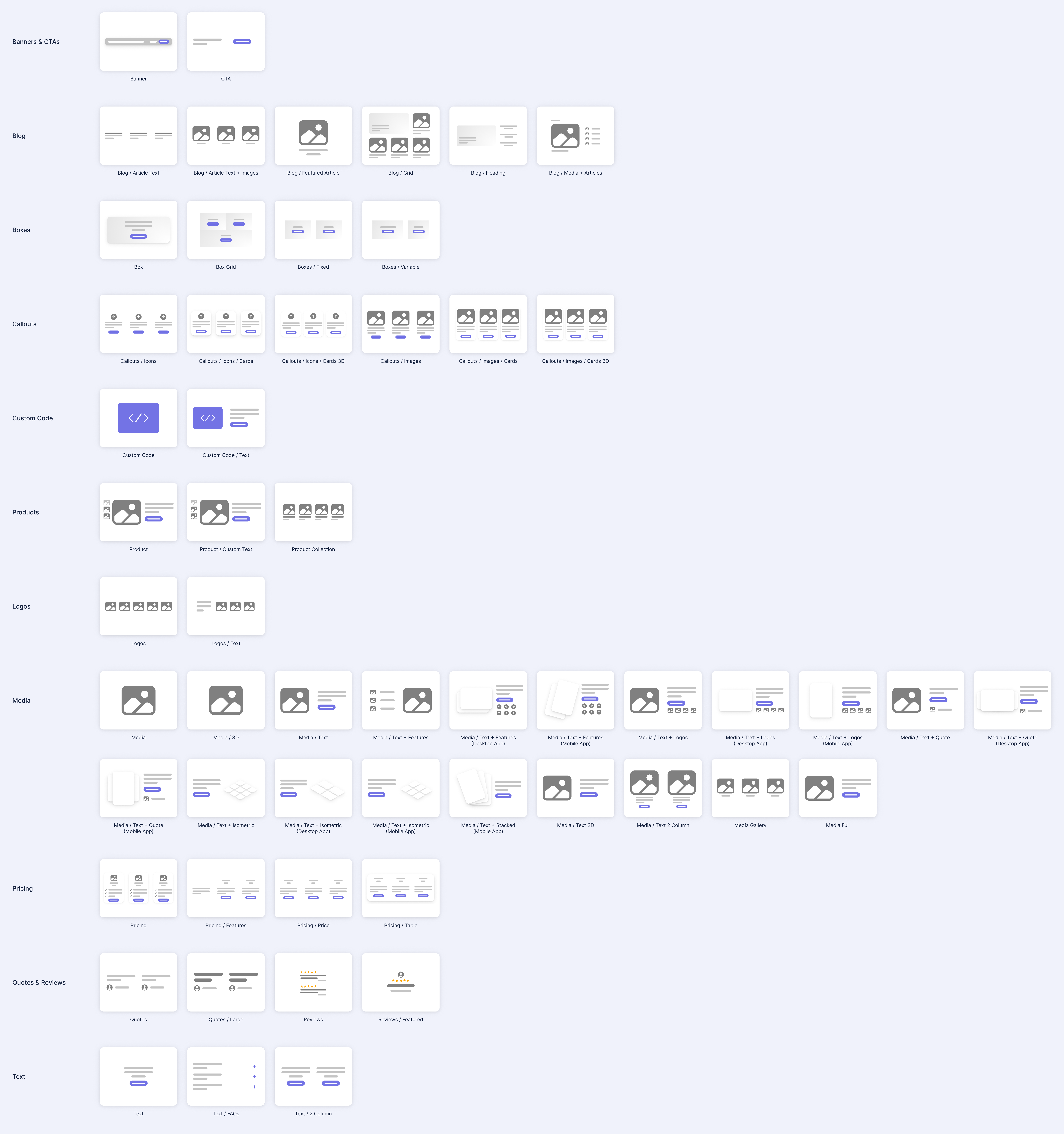
Recategorized Components

We spent some time reorganizing renaming components to make it easier to find what you are looking for in the component selector. We also added thumbnails for some of the components that didn’t have them. There is more work to come on this to make it even better, but it’s already easier to find some things.

Reordering and Renaming Components

Template Updates

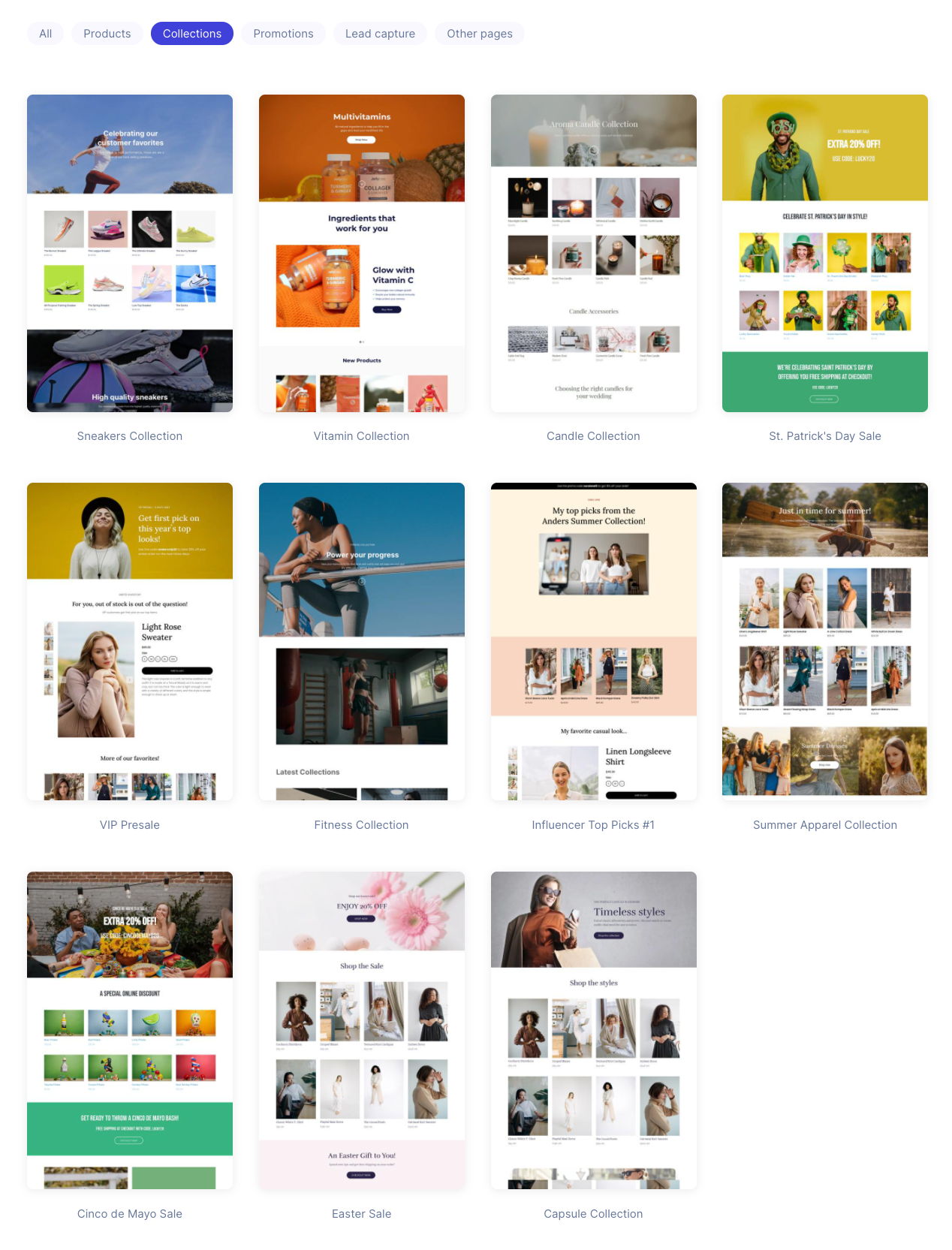
We rolled out an update to allow our backend teams to more-easily launch the templates that they've been working on. This includes changes to way we generate screenshots of these templates as well as the way that we add them to accounts.

View all of our templates!

Templates

Complete List of Resolved Items

  • Rolled out a change to the way our components are categorized to make it easier to navigate.
  • Added support for keyboard handling to dropdowns when setting conditions.
  • Fixed a bug where the image of a variant wasn't updating when the variant was selected.
  • Adjusted the default state of box width to display "auto" instead of "none" .
  • Rolled out changes to our template screenshots to reduce file sizes and speed up the page.
  • Improved the handling speed of several backend jobs.
  • Adjusted all of the links used in the app to use a URL that lets our product, support, and marketing teams make rapid changes to them.
  • Fixed a bug with the image callouts component where the first icon in the section would be misaligned vertically.
  • Fixed a bug where the dynamic content would sometimes handle the "or" operator (the pipe character "|") incorrectly.
  • Fixed a bug where some users would get a 500 error when "choosing a product".

Major You can now integrate Elastic Path Commerce Cloud with your other company systems using message queuing services that support the Message Simple Text Orientated Messaging Protocol (STOMP), for example, Amazon MQ. See Integrations.

Minor Added cancelled state to the order status. You can now update the status of an unfulfilled order to cancelled. For more information, see the Cancel an Order by ID section.

Overview

A tiny release with a few fixes and tweaks.

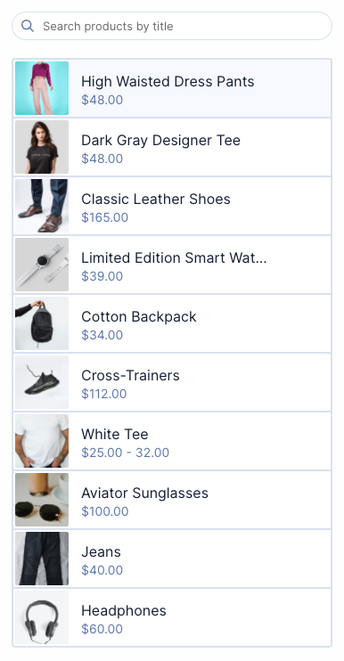
Polish on product list items

We squared up the product and collection thumbnails to better accommodate stores that aren’t using portrait images ( landscape or square).

We also improved the hover effects and made some other subtle style tweaks. This impacts the product selection drawers and the index pages for products and collections.

Product List Items

Dark and light text toggle on boxes

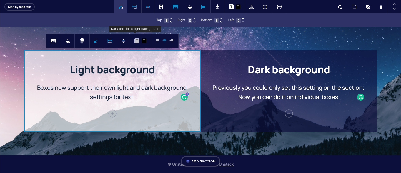
Boxes now support their own light and dark background settings for text. Previously you could only set this setting on the section. Now you can do it on individual boxes.

Both sections and individual boxes have this setting. If it’s not set on a specific box, the box will inherit the setting from the section.

Darka and Light Text Toggle

Complete List of Resolved Items

  • Pushed a several QoL updates for the list of products shown when selecting a product.
  • Added dark/light text toggle to boxes.
  • Pushed backend changes for how components handle properties.
  • Adjusted the spacing of action links when used as the CTA in a section.
  • Fixed a bug where a section could not be duplicated.
  • Fixed the link "Click Here" uses when saving a template.
  • Fixed a bug where the page manager filter for "Live pages with A/B tests" was not working properly.
  • Fixed a backend bug having to do with invalid Stripe subscriptions.

Bug Fix Commerce Manager: Fixed a bug where users got an authentication loop after a failed authentication.

Minor Commerce Manager: Users can now filter the accounts list by account name in Account Management.

Bug Fix Commerce Manager: Fixed a bug where an image uploader breaks when user attempts to type in a URL.

Minor Commerce Manager: Added cart expiration in settings.

Overview

A smaller release, but we shipped a few features and tweaks in addition to a number of bug fixes. Tons of work on some new features and editor improvements that will both land in a future release.

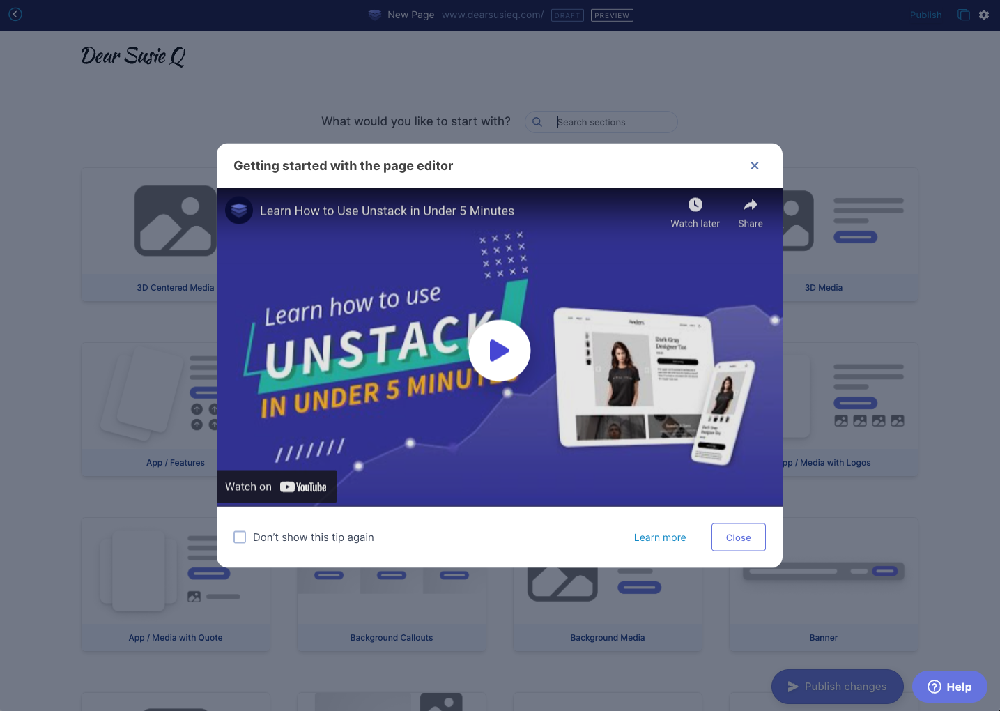
Intro video for the page editor

As part of our work to improve the onboarding experience, a popup intro video for the editor will appear the first five times you enter the editor. You can also dismiss the tip permanently if you choose to.

Introductory Video

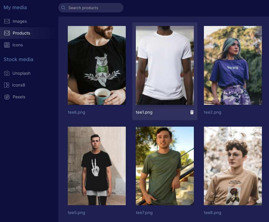
Product images for all media

There’s a new folder in the media manager for Products where images that are imported from Shopify products will appear. This will make it easier to use product images in any Studio component.

Product Images

Domain settings for Shopify

We cleaned up the domain settings for Shopify customers using the App Proxy functionality to load CX-Studio pages on their Shopify domain. When you’re using App Proxy it now shows “Point to Shopify” and you aren’t able to change it (we will probably enable people to change this in the future).

domain.png

Form Width

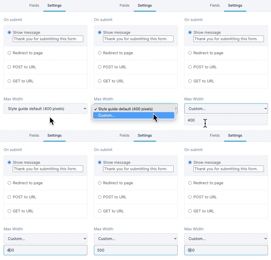
In this release, we rolled out changes so that you can set a custom width for a form. All forms will use the style guide setting by default, but you can now set a custom width:

  1. In the admin portal, under Forms, open the form you want to change

  2. Click on the Settings tab

  3. Under Max Width, select Custom...

  4. Enter a number and save!

    Form Width

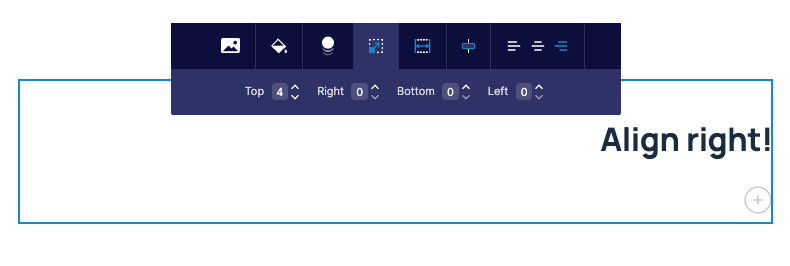
Text-align Right

You can now align text to the right! This is something we probably should have done a long time ago, but we’re only now getting to it along with a number of other editor improvements.

Rigt-alignment of Text

Complete List of Resolved Items

  • Added intro video for the editor.
  • Added deep-links. Among other things, this allows us to provide one URL that all users can use to access a specific part of their account. For example, https://app.CX-Studio.com/goto/landing-pages will now take you to the landing pages section in your account.
  • Adjusted media policy to allow product images to be used any place where media can be used.
  • Updated the Studio UI to account for Shopify plans which use the proxy by default.
  • Fixed a mobile-specific issue where text would overlap in the product component.
  • Pushed a change to allow users to be able to set a max-width for their forms.
  • Added support for text-align right.
  • Fixed an issue with our HubSpot integration which prevented users from being able to add their HubSpot forms to a page.
  • Fixed an issue where white backgrounds were mixing button styles when a dark background was used.

Overview

Another large release shipping a few key features and a ton of small fixes.

Shopify Free Plan

We’re now putting all new Shopify accounts on a free plan. This is a temporary change until we introduce multiple Shopify plans in Q2 of 2022.

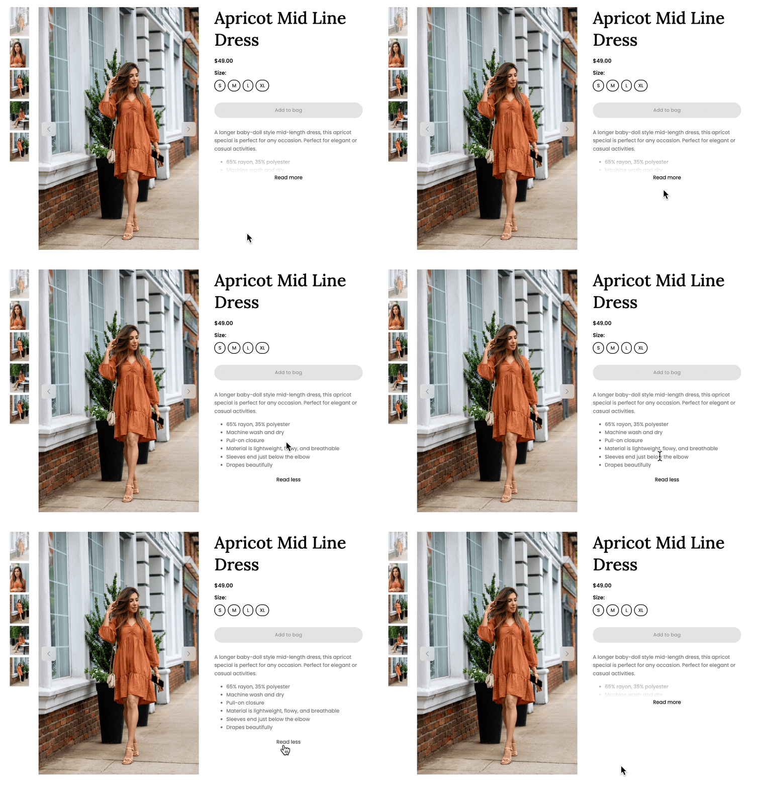
Collapsing Product Descriptions

Stores often pack product descriptions with content that’s valuable for SEO. When rendered inside of our product component that text spills down the page creating an odd unbalanced view.

In this release, we rolled out a change that hides the text behind a “Read more” link if it is longer than 5 lines.

Read More LInk

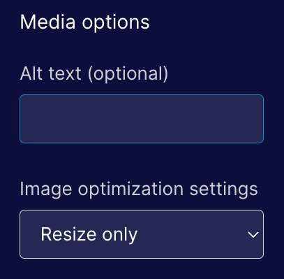
Resize-only for media

We’ve had a number of issues with image optimization being too aggressive so we’ve changed the default when adding media to Resize only.

Media Resizing

Deleting users & accounts

We added functionality for our internal teams to be able to permanently delete users and accounts from our database. In the past we haven't had a good way of handling this and previous requests took longer to resolve than we'd like.

JSX Rendering Backend

We shipped the next phase of the prep work needed to support Component Properties. When we rolled out refactor NoML to be more like JSX we added a translation layer to translate from the new syntax into the old. This allowed us to use to avoid rewriting the rendering layer. In this release we rewrote the rendering layer so it’s no longer using the old syntax.

Complete List of Resolved Items

  • Launched the free plan for Shopify.
  • Fixed an issue where templates with product collection components (but no product components) were asking for a product.
  • Fixed an issue where customers synced from Shopify has their locations malformed during the sync.
  • Rolled out an improvement for collapsing product descriptions when they are more than five lines long.
  • Fixed an issue where the "Add to Bag" button was missing from the editor.
  • Fixed another issue where the order of products in a collection component was different when viewing the component in the page builder compared to when the same component was viewed on a rendered (live) page.
  • Pushed improvements to our JSX rending backend.
  • Changed the default image optimization setting to "Resize Only".
  • Fixed an issue where some page settings would be auto-populated if using a page template.
  • Fixed an issue with landing page headers inheriting the wrong styles when rendering over a dark background.
  • Removed DDC option from nav menu on Free, Lite, Full, and Full+ plans.
  • Fixed an issue with DDC pages where they used the slug placeholder of "%" as value of both the canonical and OG:URL, URLs.
  • Removed contact.type & contact.persona from conditional content UI as neither are used.
  • Created a tool for our Support team to be able to delete users & accounts from the database.
  • Fixed an issue with the Pricing/Features section being cutoff when too many cards are added.
  • Fixed a bug that occurred when a date was removed from the settings of a blog article.
  • Fixed an issue where users weren't able to save a page when missing a required field.
  • Fixed an issue with an image in the "new lead" email notifications.